您现在的位置是:网站首页> 编程资料编程资料
一款css实现的鼠标经过按钮的特效css3中transform属性实现的4种功能详解CSS3.0(Cascading Style Sheet) 层叠级联样式表纯CSS3实现div按照顺序出入效果CSS3实现列表无限滚动/轮播效果css3 利用transform-origin 实现圆点分布在大圆上布局及旋转特效CSS3实现的侧滑菜单CSS3实现的3D隧道效果用CSS3画一个爱心css3 实现文字闪烁效果的三种方式示例代码六种css3实现的边框过渡效果
 2021-09-06
1561人已围观
2021-09-06
1561人已围观
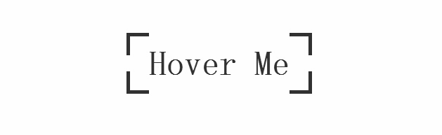
简介 css3实现的鼠标经过按钮特效,按钮初始时,边框为断开的按钮,当鼠标经过按钮时动画变为封闭的边框,经测试,还不错,喜欢的朋友可以看看
今天要为各网友再带来一款css实现的鼠标经过按钮的特效。按钮初始时,边框为断开的按钮,当鼠标经过按钮时动画变为封闭的边框。效果图如下:
源码下载
我们一起看下实现的代码:
html代码:
css代码:
*, *:before, *:after
{
margin: 0;
padding: 0;
-webkit-box-sizing: border-box;
-moz-box-sizing: border-box;
box-sizing: border-box;
}
body
{
padding-top: 10%;
text-align: center;
overflow-x: hidden;
}
.btn-edge
{
position: relative;
display: inline-block;
padding: 1rem 2rem;
font-family: 'Titillium Web' , sans-serif;
font-weight: 700;
text-decoration: none;
font-size: 3rem;
color: #333;
background-image: -webkit-gradient(linear, left top, left bottom, from(#333), to(#333)), -webkit-gradient(linear, left top, left bottom, from(#333), to(#333)), -webkit-gradient(linear, left top, left bottom, from(#333), to(#333)), -webkit-gradient(linear, left top, left bottom, from(#333), to(#333)), -webkit-gradient(linear, left top, left bottom, from(#333), to(#333)), -webkit-gradient(linear, left top, left bottom, from(#333), to(#333)), -webkit-gradient(linear, left top, left bottom, from(#333), to(#333)), -webkit-gradient(linear, left top, left bottom, from(#333), to(#333));
background-image: -webkit-linear-gradient(#333, #333), -webkit-linear-gradient(#333, #333), -webkit-linear-gradient(#333, #333), -webkit-linear-gradient(#333, #333), -webkit-linear-gradient(#333, #333), -webkit-linear-gradient(#333, #333), -webkit-linear-gradient(#333, #333), -webkit-linear-gradient(#333, #333);
background-image: linear-gradient(#333, #333), linear-gradient(#333, #333), linear-gradient(#333, #333), linear-gradient(#333, #333), linear-gradient(#333, #333), linear-gradient(#333, #333), linear-gradient(#333, #333), linear-gradient(#333, #333);
background-repeat: no-repeat;
-webkit-background-size: 2rem 5px, 2rem 5px, 2rem 5px, 2rem 5px, 5px 2rem, 5px 2rem, 5px 2rem, 5px 2rem;
background-size: 2rem 5px, 2rem 5px, 2rem 5px, 2rem 5px, 5px 2rem, 5px 2rem, 5px 2rem, 5px 2rem;
background-position: 0 0, 100% 0, 0 100%, 100% 100%;
-webkit-box-shadow: inset 0 0 0 5px rgba(255, 99, 71, 0);
box-shadow: inset 0 0 0 5px rgba(255, 99, 71, 0);
-webkit-transition: background-size 1s .4s, -webkit-box-shadow .4s, color .4s;
transition: background-size 1s .4s, box-shadow .4s, color .4s;
-webkit-transform: translateZ(0);
transform: translateZ(0);
}
.btn-edge:hover
{
color: tomato;
-webkit-background-size: 100% 5px, 100% 5px, 100% 5px, 100% 5px, 5px 100%, 5px 100%, 5px 100%, 5px 100%;
background-size: 100% 5px, 100% 5px, 100% 5px, 100% 5px, 5px 100%, 5px 100%, 5px 100%, 5px 100%;
-webkit-box-shadow: inset 0 0 0 5px tomato;
box-shadow: inset 0 0 0 5px tomato;
-webkit-transition: background-size 1s, -webkit-box-shadow .4s .6s, color .4s .6s;
transition: background-size 1s, box-shadow .4s .6s, color .4s .6s;
}

源码下载
我们一起看下实现的代码:
html代码:
复制代码
代码如下:css代码:
复制代码
代码如下:*, *:before, *:after
{
margin: 0;
padding: 0;
-webkit-box-sizing: border-box;
-moz-box-sizing: border-box;
box-sizing: border-box;
}
body
{
padding-top: 10%;
text-align: center;
overflow-x: hidden;
}
.btn-edge
{
position: relative;
display: inline-block;
padding: 1rem 2rem;
font-family: 'Titillium Web' , sans-serif;
font-weight: 700;
text-decoration: none;
font-size: 3rem;
color: #333;
background-image: -webkit-gradient(linear, left top, left bottom, from(#333), to(#333)), -webkit-gradient(linear, left top, left bottom, from(#333), to(#333)), -webkit-gradient(linear, left top, left bottom, from(#333), to(#333)), -webkit-gradient(linear, left top, left bottom, from(#333), to(#333)), -webkit-gradient(linear, left top, left bottom, from(#333), to(#333)), -webkit-gradient(linear, left top, left bottom, from(#333), to(#333)), -webkit-gradient(linear, left top, left bottom, from(#333), to(#333)), -webkit-gradient(linear, left top, left bottom, from(#333), to(#333));
background-image: -webkit-linear-gradient(#333, #333), -webkit-linear-gradient(#333, #333), -webkit-linear-gradient(#333, #333), -webkit-linear-gradient(#333, #333), -webkit-linear-gradient(#333, #333), -webkit-linear-gradient(#333, #333), -webkit-linear-gradient(#333, #333), -webkit-linear-gradient(#333, #333);
background-image: linear-gradient(#333, #333), linear-gradient(#333, #333), linear-gradient(#333, #333), linear-gradient(#333, #333), linear-gradient(#333, #333), linear-gradient(#333, #333), linear-gradient(#333, #333), linear-gradient(#333, #333);
background-repeat: no-repeat;
-webkit-background-size: 2rem 5px, 2rem 5px, 2rem 5px, 2rem 5px, 5px 2rem, 5px 2rem, 5px 2rem, 5px 2rem;
background-size: 2rem 5px, 2rem 5px, 2rem 5px, 2rem 5px, 5px 2rem, 5px 2rem, 5px 2rem, 5px 2rem;
background-position: 0 0, 100% 0, 0 100%, 100% 100%;
-webkit-box-shadow: inset 0 0 0 5px rgba(255, 99, 71, 0);
box-shadow: inset 0 0 0 5px rgba(255, 99, 71, 0);
-webkit-transition: background-size 1s .4s, -webkit-box-shadow .4s, color .4s;
transition: background-size 1s .4s, box-shadow .4s, color .4s;
-webkit-transform: translateZ(0);
transform: translateZ(0);
}
.btn-edge:hover
{
color: tomato;
-webkit-background-size: 100% 5px, 100% 5px, 100% 5px, 100% 5px, 5px 100%, 5px 100%, 5px 100%, 5px 100%;
background-size: 100% 5px, 100% 5px, 100% 5px, 100% 5px, 5px 100%, 5px 100%, 5px 100%, 5px 100%;
-webkit-box-shadow: inset 0 0 0 5px tomato;
box-shadow: inset 0 0 0 5px tomato;
-webkit-transition: background-size 1s, -webkit-box-shadow .4s .6s, color .4s .6s;
transition: background-size 1s, box-shadow .4s .6s, color .4s .6s;
}
相关内容
- div+css让div内部元素如单选按钮均匀分布设置div背景透明的方法示例CSS实现div不设高度完全居中div自适应高度自动填充剩余高度详解DIV+CSS的命名规矩才能有利于SEO优化的实现方法DIV或者DIV里面的图片水平与垂直居中的方法详解如何用div实现自制滚动条div对齐与网页布局详解DIV+CSS实现电台列表设计的示例代码div+css实现带箭头的面包屑导航栏不定宽高的文字在div中垂直居中实现方法
- 通过CSS禁用页面内容选中和复制操作CSS Transition通过改变Height实现展开收起元素从QQtabBar看css命名规范BEM的详细介绍css实现两栏布局,左侧固定宽,右侧自适应的多种方法CSS 实现Chrome标签栏的技巧CSS实现两列布局的N种方法CSS实现隐藏搜索框功能(动画正反向序列)CSS3中Animation实现简单的手指点击动画的示例详解CSS中的特指度和层叠问题详解overflow:hidden的作用(溢出隐藏、清除浮动、解决外边距塌陷)关于CSS浮动与取消浮动的问题
- 响应式网页设计的快速教程(适合个人站点)CSS Transition通过改变Height实现展开收起元素从QQtabBar看css命名规范BEM的详细介绍css实现两栏布局,左侧固定宽,右侧自适应的多种方法CSS 实现Chrome标签栏的技巧CSS实现两列布局的N种方法CSS实现隐藏搜索框功能(动画正反向序列)CSS3中Animation实现简单的手指点击动画的示例详解CSS中的特指度和层叠问题详解overflow:hidden的作用(溢出隐藏、清除浮动、解决外边距塌陷)关于CSS浮动与取消浮动的问题
- CSS教程高级应用 2个纯CSS面包屑导航栏实现代码html+css+js实现导航栏滚动渐变效果不可思议的CSS导航栏下划线跟随效果html+css 实现简易导航栏功能CSS中的导航栏和下拉菜单的实现纯CSS实现导航栏下划线跟随滑动效果使用CSS制作立体导航栏div+css实现带箭头的面包屑导航栏CSS导航栏及弹窗示例代码纯CSS实现导航栏Tab切换效果CSS利用伪元素实现导航栏斜线分隔
- CSS3 重置iphone浏览器按钮input,select等表单元素的默认样式css3实现的iPhone X手机桌面背景图片切换效果源码纯CSS3仿iPhone文件夹特效源码纯CSS3模拟iPhone X屏幕背景切换动画特效jQuery+CSS3实现iPhone手机锁屏解锁动画特效源码构建iPhone企业级应用-基于HTML,CSS和JavaScript pdf扫描版CSS3模拟iPhone4界面 滑动解锁代码下载jQuery+CSS仿iPhone手机天气显示的动画纯 CSS 制作逼真的 iphone7
- css3 图片圆形显示 如何CSS将正方形图片显示为圆形图片布局用css实现正方形div 的两种方法CSS实现一个自适应的正方形的方法示例
- DIV+CSS中让布局、背景图片、文字内容居中的方法CSS实现背景图片透明而文字不透明效果的两种方法css实现文字在背景图片之上
- 独行DIV自适应宽度布局CSS实例与应用范围CSS min-height IE6、IE7、FF下DIV自适应高度设置DIV最小高度以及高度自适应随着内容的变化而变化CSS 实现div宽度根据内容自适应
- CSS滤镜实现的颜色渐变翻转效果 利用纯css实现图片翻转的效果一款基于css3麻将筛子3D翻转特效的实例教程css3实现3D色子翻转特效一款利用纯css3实现的360度翻转按钮的实例教程纯CSS实现菜单、导航栏的3D翻转动画效果css控制列表与导航的制作(水平导航条、垂直翻转的列表、垂直导航栏、内css3的图形3d翻转效果应用示例CSS图片翻转动画技术详解(IE也实现了)CSS旋转与翻转使用示例详解CSS Cookbook 创建文字导航菜单和翻转特效
- 屏蔽双击选中文字的方法兼容FF及以外的浏览器猎豹浏览器开启广告过滤屏蔽广告显示的几种途径浏览器屏蔽百度推广广告的设置方法猎豹浏览器屏蔽JS功能的方法